Designing a website that looks great on every screen size can be challenging. A layout that works perfectly on desktop may look completely different on tablet or mobile.
Responsive web design isn’t about creating a desktop design and then shrinking it for mobile.
A good responsive website needs to adapt.
Content changes.
Headlines become longer.
Buttons change size.
Cards stack.
Navigation collapses.
Images resize.
Columns become rows.
This is where Figma Auto Layout becomes incredibly useful.
Instead of manually positioning every element, Auto Layout allows designers to create interfaces that behave more like real web layouts.
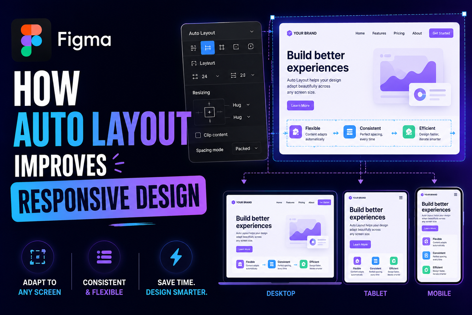
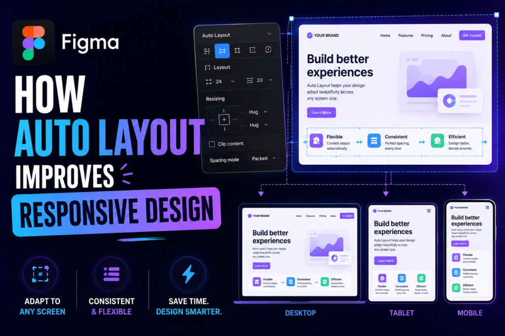
Auto Layout allows designers to create flexible designs that automatically adjust when content, spacing, or screen sizes change. Instead of manually repositioning every element, you can build layouts that behave more like real responsive websites.
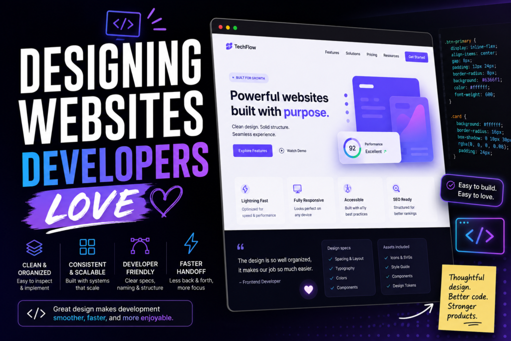
For developers, this can make the transition from Figma to WordPress much more predictable.
Here’s how Auto Layout can improve your responsive design workflow.
What Is Figma Auto Layout?
Auto Layout is a Figma feature that allows elements inside a frame to automatically respond to changes in their content, spacing, and dimensions.
Instead of manually moving objects whenever something changes, you define how elements should behave.
You can control things such as:
- Direction
- Spacing
- Padding
- Alignment
- Sizing
- Wrapping
- Content growth
For example, imagine a button containing:
Get Started
If the text changes to:
Start Your Free Consultation
a manually positioned button may need to be resized and repositioned.
With Auto Layout, the button can expand based on its content.
That’s much closer to how a real responsive interface behaves.
Why Auto Layout Matters for Responsive Web Design
The biggest benefit of Auto Layout is that it encourages designers to think about behavior instead of positions.
Traditional design workflows can lead to questions like: Where should this element sit?
Responsive design requires a different question: How should this element behave when the available space changes?
That’s an important distinction.
A website isn’t a fixed canvas.
It’s a flexible system.
Auto Layout helps designers model that flexibility inside Figma.
Traditional design often requires manually positioning every element. If the content changes, you may need to move several objects around to make everything fit.
Auto Layout changes this approach.
Elements inside an Auto Layout frame automatically respond to changes in their content and spacing.
For example, if a button changes from:
Learn More
to:
Learn More About Our Services
the button can automatically expand instead of requiring you to resize it manually.
The result: more flexible and realistic designs.
Buttons are one of the simplest examples of where Auto Layout makes a difference.
Instead of setting a fixed width, you can add horizontal and vertical padding to the button.
This means the button automatically grows or shrinks based on its text.
For example:
Get Started
can become:
Start Your Free Consultation
without breaking the design.
This is especially useful when designing websites where button labels may change during development.
Manage Spacing Automatically
Consistent spacing is an important part of responsive design.
Auto Layout allows you to define spacing between elements instead of manually positioning each one.
For example, a card might contain:
With Auto Layout, you can define the spacing between each element. If the description becomes longer, the button automatically moves down while maintaining the correct spacing.
This creates a more predictable layout.
Cards are commonly used for services, blog posts, products, testimonials, and other website content.
Auto Layout makes it easier to create cards that adapt to different amounts of content.
For example, a service card could automatically adjust when:
- The heading becomes longer
- The description changes
- An image is replaced
- A button label changes
Instead of manually adjusting the card every time, the layout responds automatically.
This makes your designs much easier to scale.
Build Flexible Navigation
Navigation bars can become complicated when designing multiple screen sizes.
Desktop navigation might contain:
Home · About · Services · Projects · Contact
while mobile navigation may need to switch to a menu icon.
Auto Layout helps you structure the desktop navigation so spacing between navigation items remains consistent.
You can also combine Auto Layout with components and variants to create different navigation states for desktop, tablet, and mobile.
Create Better Mobile Designs
Responsive design isn’t just about making desktop layouts smaller.
Mobile layouts often require elements to stack vertically, change alignment, or use different spacing.
Auto Layout makes these changes easier to manage.
For example, a desktop section might have:
Image → Text → Button
while a mobile version could become:
Image
Text
Button
Auto Layout allows these elements to adapt without requiring you to manually reposition everything.
Use Hug, Fill, and Fixed Sizing
One of the most powerful aspects of Auto Layout is its sizing behavior.
Figma provides options such as:
Hug Contents
The element adjusts its size based on its content.
This is perfect for buttons, labels, and badges.
Fill Container
The element expands to use the available space.
This is useful for columns, input fields, and responsive sections.
Fixed
The element maintains a specific width or height.
This can be useful for elements that need consistent dimensions.
Combining these sizing options gives you much greater control over responsive layouts.
Reduce Manual Adjustments
Without Auto Layout, changing one element can cause a chain reaction.
You change the heading.
Then the paragraph needs to move.
Then the button needs to move.
Then the card needs to be resized.
Then the section needs to be adjusted.
With Auto Layout, these relationships can be handled automatically.
This means you can spend less time fixing layouts and more time improving the actual user experience.
Make Design Handoff Easier
Build Scalable Design Systems
A responsive Figma design should communicate more than just how a page looks.
It should also show developers how the layout is expected to behave.
Auto Layout helps communicate these relationships clearly.
Developers can better understand:
- Which elements expand
- Which elements maintain fixed dimensions
- How spacing works
- How content affects layout
- How elements are grouped
- How components behave
This can make the transition from Figma to development much smoother.
Auto Layout becomes even more powerful when combined with Components, Variants, and Variables.
You can create reusable components that automatically adapt to different content and contexts.
For example, a design system might contain:
Button → Primary → Large → Mobile
Button → Secondary → Medium → Desktop
Card → Service → Featured
Instead of rebuilding each variation manually, you can create a flexible system that scales across an entire website or application.
My Figma-to-WordPress Approach
When I receive a Figma design that needs to become a WordPress website, I don’t look at it as a collection of screenshots.
I look for the system underneath the design.
I identify:
Reusable components
What should become a reusable website component?
Content structures
Which elements should be controlled through WordPress?
Responsive behavior
How should the components change between screen sizes?
Dynamic content
Which sections will contain variable content?
Design tokens
Which colors, typography, spacing, and dimensions should be consistent?
Development requirements
Does the implementation require Gutenberg, ACF, custom templates, WooCommerce, or custom functionality?
This approach makes the final WordPress website easier to maintain and extend.
Auto Layout vs. Manual Positioning
The difference becomes clear when you compare the two approaches.
| Manual Design | Auto Layout |
|---|
| Elements are positioned individually | Elements respond to layout rules |
| Changes require manual adjustments | Changes happen automatically |
| Harder to maintain | Easier to maintain |
| Less flexible | More flexible |
| Time-consuming for large projects | Faster for scalable projects |
| Difficult to simulate responsive behavior | Better suited for responsive layouts |
For modern web design, Auto Layout provides a much more efficient way to think about layouts.
Responsive design is about creating layouts that can adapt to different devices and content.
Figma Auto Layout makes this process much easier.
Instead of designing static screens and manually adjusting every element, you can create flexible structures that behave more like real interfaces.
By combining Auto Layout with Components, Variants, and Variables, you can create designs that are more consistent, scalable, and developer-friendly.
The biggest shift is simple:
Don’t just design where elements are. Design how they behave.
That’s what makes Auto Layout such a valuable tool for modern UI/UX designers.
Figma-to-WordPress development · Custom WordPress · WooCommerce · Responsive development · Technical SEO