Heide Rubiato | Full-Stack WordPress Developer

10 Figma Features Every Designer Should Use
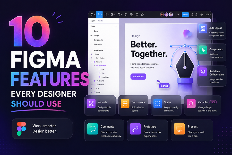
Most of the time lost in a Figma file isn’t spent designing. It goes on nudging spacing by hand, renaming layers before handoff, and rebuilding the same card four times because the client asked for one more variant. These ten features remove that work.
I use every one of them on client projects — landing pages, dashboards, marketing sites — and they’re the difference between a file a developer thanks you for and a file they quietly rebuild from scratch.
01
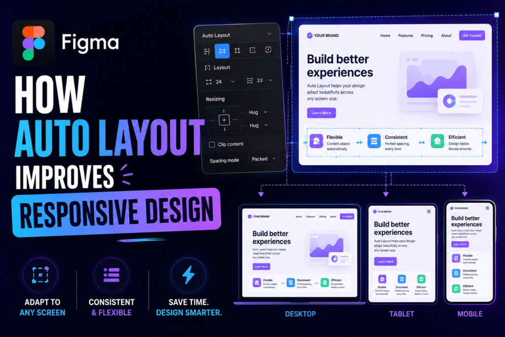
Auto Layout
Auto Layout turns a frame into a flexbox container: children stack in a direction, with padding and a gap you set once. Change the text in a button and the button resizes around it. Add a card to a row and the row redistributes.
The part most people skip is nesting. A section is a vertical stack of rows; a row is a horizontal stack of cards; a card is a vertical stack of text. Build it that way and the whole page reflows when content changes.
- Shift + A wraps a selection in Auto Layout
- Set gap to "Auto" for space-between behaviour
- Use "Hug contents" on text, "Fill container" on layout frames
02
Variables and modes
Variables store values — colours, numbers, strings, booleans — and modes let one variable hold different values per context. One colour collection with a light mode and a dark mode means you flip an entire page by changing a dropdown, not by maintaining two files.
Where this pays off: spacing variables. Define 4 / 8 / 16 / 24 / 32 as number variables and apply them to Auto Layout gaps. When a client wants a roomier layout, you edit five numbers instead of two hundred frames.
03
Component properties
Instead of twelve button variants, build one component with properties: a boolean for the icon, a text property for the label, an instance swap for the icon itself. The designer using it gets a short panel of options rather than a variant dropdown they have to decode.
It also keeps your library honest. If a property can’t express the difference, it probably deserves to be a separate component.
04
Interactive components
Hover, pressed, focus and disabled states can live inside the component and trigger on their own. Prototype once, and every instance across every page behaves correctly without extra wiring.
Clients notice this immediately. A prototype where the nav actually highlights on hover reads as finished work; one where nothing responds reads as a picture of a website.
“
A prototype that responds to the cursor gets approved in one round. A static mockup gets three rounds of “can I see how it feels?”
05
Text and colour styles
Styles are still the fastest way to enforce a type scale. Name them the way a developer thinks — Heading/H2, Body/Regular, Label/Small — and those names carry straight into the CSS or component library.
Keep the scale small. Six text styles and a dozen colours will cover a marketing site; anything more is usually indecision rather than range.
06
Constraints and resizing
Auto Layout handles most flow, but constraints still control what happens to absolutely positioned elements when a frame resizes — background shapes, decorative blobs, sticky bars. Set them deliberately and your desktop frame can be dragged to tablet width to sanity-check the layout before you build the responsive versions.
07
Dev Mode
Make developer handoff less painful
One of the biggest problems between designers and developers is missing information.
Dev Mode gives developers measurements, variable names, exported assets and a change log without them needing to touch your layers. Your job is to make what it shows worth reading:
- Mark frames as "Ready for dev" so nobody builds a draft
- Name layers by role, not by shape — card/price, not Rectangle 47
- Annotate anything the design can't show: empty states, error copy, scroll behaviour
Figma’s developer-focused features help make this information easier to inspect.
For a WordPress developer, this can be particularly useful when converting a Figma design into:
- Gutenberg blocks
- Elementor layouts
- Custom WordPress themes
- ACF components
- WooCommerce templates
- Custom frontend components
Good handoff isn’t about giving a developer a screenshot.
It’s about giving them enough information to understand the intended system.
08
Sections and page structure
Design with real content in mind
One of the easiest mistakes in Figma is designing a beautiful layout using perfectly sized placeholder content.
Real websites aren’t that predictable.
- A heading might be longer.
- A product title might wrap onto three lines.
- A button label might change.
- A client might add another paragraph.
That’s why I prefer designing components and sections that can handle changing content.
Think about:
- Different screen sizes
- Longer headings
- Short and long button labels
- Different image ratios
- Missing content
- Additional cards
- Mobile stacking
- Flexible containers
Sections group frames into labelled, collapsible regions on the canvas. Use them to separate explorations from the approved direction so a client clicking through the file never lands on a version you abandoned.
My default page structure: Cover, Design System, Desktop, Mobile, Prototype, Archive. Same order on every project, so returning to a file six months later takes seconds.
This makes the design much more useful when it reaches development.
09
Three plugins worth keeping
Plugin lists get long and most go unused. These three earn their place:
- Content Reel — real-feeling names, avatars and copy instead of lorem ipsum
- Stark — contrast checks against WCAG while you design, not after
- Batch Styler — edit dozens of text or colour styles at once when a brand shifts
10
Version history and branching
Name your versions at meaningful points — “Client review v2”, “Approved for build” — so history is a timeline rather than a wall of autosaves. For bigger redesigns, branch the file, explore freely, and merge only what survives review. The main file stays stable for anyone building from it.
11
Figma Is More Powerful When Designers Think Like Developers
You don’t need to become a developer to design better websites.
But understanding how websites are actually built can make your Figma work significantly stronger.
For example, knowing how:
CSS flexbox works can improve your Auto Layout decisions.
Understanding responsive breakpoints can improve your layouts.
Understanding CMS content can help you design flexible components.
Understanding WordPress can help you create realistic page structures.
Understanding SEO can help you preserve content hierarchy.
Understanding accessibility can influence typography, contrast, buttons, forms, and interactions.
The closer the design is to the realities of development, the smoother the project becomes.
12
My Figma-to-WordPress Workflow
When a Figma design is going to become a WordPress website, I typically think about the project in several layers.
01. Design
Understand the visual system, components, layouts, and interactions.
02. Structure
Identify reusable sections, content types, templates, and page relationships.
03. Responsive Behavior
Determine how components should behave across desktop, tablet, and mobile.
04. CMS Architecture
Identify which content should be editable and how it should be structured in WordPress.
05. Development
Translate the design into reusable WordPress components, templates, blocks, or custom functionality.
06. Optimization
Consider performance, accessibility, SEO, responsive behavior, and maintainability.
07. Testing
Compare the implementation against the original design and test the experience across devices.
This approach helps prevent the common situation where the Figma design looks perfect but becomes difficult to reproduce or maintain in the actual website.
13
The Goal Isn't Pixel-Perfect Screenshots
Pixel accuracy matters.
But a website isn’t a screenshot.
It’s an interactive system.
It has:
That’s why good web design needs to consider what happens after the Figma file.
A strong design system makes development easier.
A strong prototype makes user testing easier.
A strong component structure makes future changes easier.
And a strong developer handoff reduces unnecessary back-and-forth.
- Content
- Users
- Devices
- Forms
- CMS data
- Search engines
- APIs
- Integrations
- Performance requirements
- Accessibility requirements
- Business goals
14
My Final Thoughts
Figma becomes much more powerful when you stop treating it as a tool for creating static page designs and start using it as a system for designing digital products.
Auto Layout creates flexible layouts.
Components create reusable elements.
Variants handle states.
Variables and styles create consistency.
Prototypes communicate interactions.
Dev Mode improves handoff.
Design systems create structure.
Responsive thinking makes designs more realistic.
And developer-focused handoff helps turn the design into a maintainable website.
The best Figma file isn’t necessarily the one with the prettiest screens.
It’s the one that makes the final product easier to design, build, use, and maintain.
Where to start this week
Don’t try to adopt all ten at once. Pick your next project and do three things: build the page with nested Auto Layout, set spacing as number variables, and name every layer before you share the link.
That combination alone removes most handoff questions. Everything else on this list is easier to add once the structure underneath is sound.
Remote international projects · Figma-to-WordPress development · Custom WordPress · WooCommerce · Technical SEO
Need to Turn Your Figma Design Into a Website?
Have a Figma design that needs to become a real, responsive website? I can help turn your designs into a maintainable WordPress website, custom theme, Gutenberg implementation, ACF-powered component system, or WooCommerce experience.
Let’s Build It
- BLOG