Heide Rubiato | Full-Stack WordPress Developer

Designing Websites Developers Love
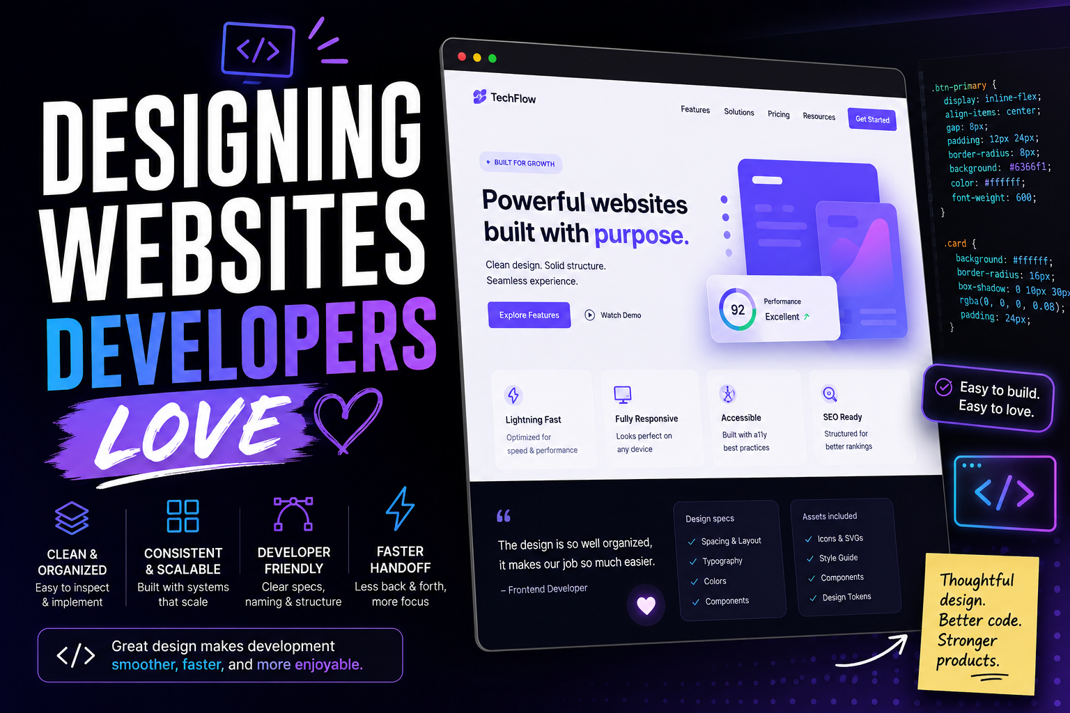
A great website design isn’t only about looking good.
It also needs to be practical, consistent, responsive, and realistic to build. Even the most visually impressive design can become a headache for developers if it contains unclear spacing, inconsistent components, missing assets, or impossible interactions.
The best designer-developer relationship starts in Figma.
When designers create files that clearly communicate how a website should work, developers can spend less time asking questions and more time building.
After years of working as a Full-Stack WordPress Developer, one of the things I’ve learned is that the best designs aren’t just beautiful — they’re buildable.
My experience includes converting UI/UX designs from Figma, XD, and Photoshop into responsive WordPress websites, while working with custom themes, ACF structures, plugins, APIs, performance, SEO, accessibility, and responsive behavior.
So what makes a design easier for developers to build?
Here are some practical ways to design websites developers will love working with.
01
Use a Consistent Design System
One of the biggest problems developers encounter is a design that only works with perfect placeholder content.
A heading is exactly two lines.
A button has exactly eight characters.
Every card has the same amount of text.
Every image has the same dimensions.
Real websites don’t behave that way.
A WordPress website may contain content entered by:
- Marketing teams
- Editors
- Administrators
- Store managers
- Clients
- Contributors
That content can change.
A heading might become longer.
A paragraph might be removed.
A product name might wrap.
A blog card might contain a different image.
A good design should anticipate these situations.
Instead of asking: “Does this look good with this content?”
Ask: “What happens when the content changes?”
That’s a question developers will appreciate.
One of the easiest ways to make development smoother is to keep your design consistent.
Define reusable styles for:
- Colors
- Typography
- Spacing
- Buttons
- Form fields
- Cards
- Navigation
- Icons
Instead of creating slightly different versions of the same button throughout the website, create one reusable component with clearly defined variations.
A consistent design system makes the design easier to understand and the final website easier to maintain.
02
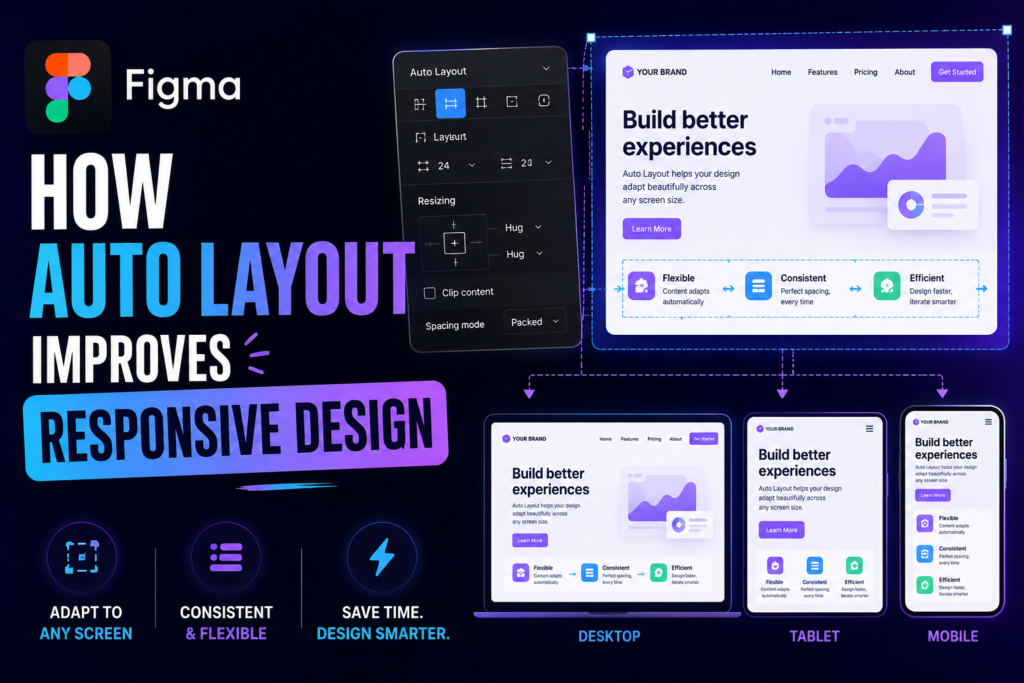
Use Auto Layout
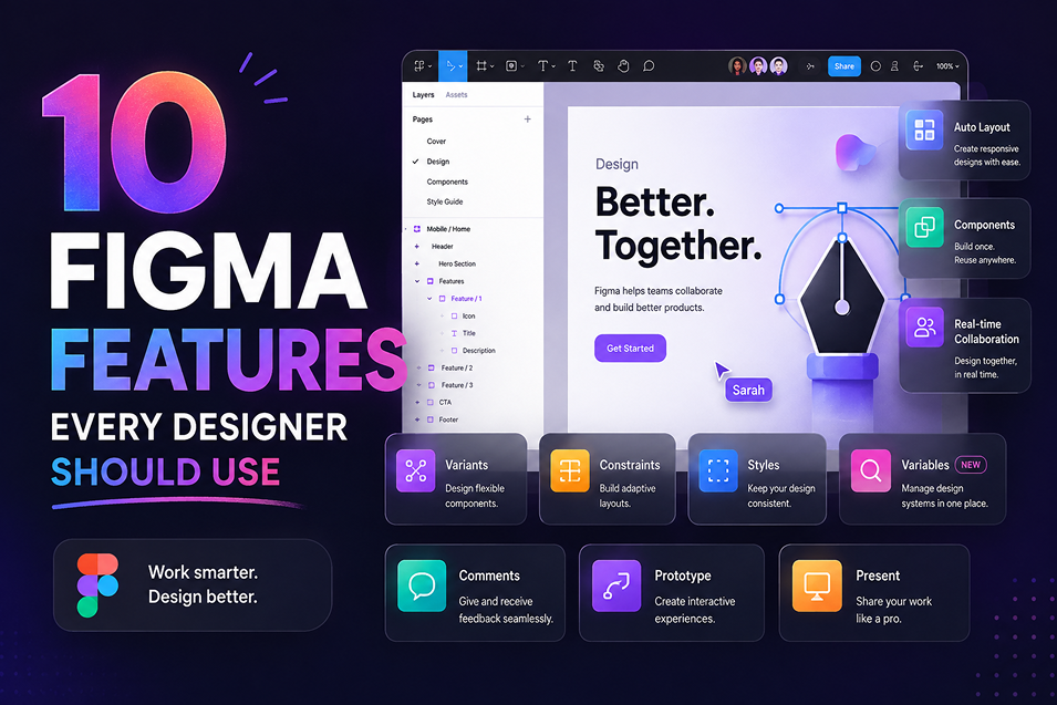
Auto Layout is one of the most valuable Figma features for developer-friendly designs.
It helps communicate how elements should behave when content or screen sizes change.
Use Auto Layout for:
- Buttons
- Cards
- Navigation
- Forms
- Content sections
- Lists
- Headers
- Footers
For example, a button shouldn’t have a random fixed width just because it looks right in one design.
Instead, use padding and content-based sizing so the button can adapt when the text changes.
This gives developers a clearer idea of how the component should behave.
03
Design for Real Content
Lorem ipsum might make a layout look perfect, but real content rarely behaves that nicely.
Headings can be longer.
Paragraphs can contain several lines.
Buttons can have different labels.
Images can have different dimensions.
Before handing off a design, test it with realistic content.
For example, don’t only test:
Learn More
Also test:
Learn More About Our Services
If the layout still works, your design is much more likely to survive development.
04
Think Responsive From the Start
A website isn’t only viewed on a desktop monitor.
Users may access it from:
- Desktop computers
- Laptops
- Tablets
- Smartphones
- Large monitors
Designing only one desktop screen and expecting developers to figure out everything else can create unnecessary problems.
Instead, consider how your layouts should adapt.
Ask yourself:
- Does the navigation collapse?
- Do columns stack?
- Does the typography scale?
- Do buttons become full width?
- Does spacing decrease?
- Do images change proportions?
- What happens to large headings?
You don’t necessarily need to design every possible screen size, but you should communicate the intended responsive behavior.
In my WordPress development work, I’ve been responsible for ensuring cross-browser compatibility and responsive behavior across devices.
The more clearly responsive behavior is communicated in the design, the fewer assumptions the developer has to make.
05
Create Reusable Components
Developers love reusable components because they make websites easier to build and maintain.
Your Figma file should reflect that same thinking.
Create components for common elements such as:
Buttons
- Primary
- Secondary
- Outline
- Disabled
Cards
- Blog card
- Service card
- Testimonial card
- Project card
Forms
- Input
- Select
- Checkbox
- Textarea
When your design is built from reusable components, developers can more easily translate those patterns into reusable code.
Components make designs more consistent and make development more predictable.
This becomes especially useful when the website will be built in WordPress / WIX / Shopify / Squarespace / Framer.
A reusable Figma component can often become a reusable WordPress component, template, block, or ACF-powered section.
The design and development systems don’t have to be identical, but they should make sense together.
06
Keep Spacing Consistent
Random spacing is one of the fastest ways to make a design difficult to implement.
Instead of using:
- 17px here
- 23px there
- 31px somewhere else
create a consistent spacing system.
For example:
8px → 16px → 24px → 32px → 48px → 64px
The exact values aren’t as important as maintaining a logical system.
Consistent spacing makes your design cleaner and gives developers predictable values to work with.
07
Don't Forget Hover and Interactive States
A static design doesn’t show developers everything they need to know.
Interactive elements often have multiple states.
For example, a button might have:
- Default
- Hover
- Active
- Focus
- Disabled
- Loading
Forms can also have:
- Default
- Focus
- Error
- Success
- Disabled
Showing these states in Figma helps developers understand the expected behavior instead of guessing.
08
Organize Your Figma File
A messy Figma file can slow down an entire project.
Developers shouldn’t have to spend 20 minutes searching for the final homepage design.
Organize your file using clear pages and sections.
For example:
01 — Research
02 — Wireframes
03 — UI Design
04 — Components
05 — Prototype
06 — Developer Handoff
You can also clearly label outdated concepts so nobody accidentally uses an old design.
A little organization goes a long way.
09
Name Layers and Components Clearly
Layer names such as:
Rectangle 47
Frame 128
Group 32
don’t provide much useful information.
Instead, use meaningful names such as:
Hero Container
Primary Button
Navigation Menu
Blog Card
Testimonial Content
Clear naming makes your Figma file easier for both designers and developers to understand.
10
Prepare Assets Properly
Make sure important assets are easy to identify and export.
This includes:
- Logos
- Icons
- Illustrations
- Product images
- Background graphics
- Custom fonts
- SVG assets
Whenever possible, use appropriate formats and provide assets at suitable sizes.
For icons and logos, vector formats such as SVG are often preferable when appropriate.
11
Don't Rely on Fixed Dimensions for Everything
Fixed dimensions can make a design look precise.
But websites need flexibility.
A section that looks perfect with a 600px heading may break when the heading becomes longer.
A button with a fixed width may fail when the text changes.
A card with a fixed height may overflow when content increases.
Instead, think about:
Minimum width
Maximum width
Flexible width
Content-driven height
Padding
Spacing
Alignment
This is one reason features such as Figma Auto Layout are so useful.
They encourage designers to think about relationships between elements instead of simply positioning objects on a canvas.
12
Don't Design Every Page as a Completely Separate Website
This is especially important for larger projects.
A website with 20 pages doesn’t necessarily need 20 completely different design systems.
Look for patterns.
Maybe these pages share the same hero.
Maybe service pages use the same content structure.
Maybe blog posts use one template.
Maybe case studies share the same layout.
Maybe several sections can use the same component with different content.
This makes the website easier to maintain after launch.
It also makes development more efficient.
13
Design With Performance in Mind
Design decisions can affect website performance.
Large background images.
Heavy animations.
Video everywhere.
Multiple font families.
Huge image dimensions.
Unnecessary visual effects.
None of these are automatically bad.
But they need to be considered.
The developer eventually has to turn those visual decisions into real assets and code.
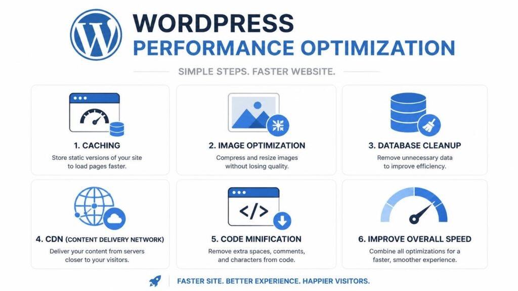
I’ve worked on WordPress performance optimization involving caching, CDN integration, lazy loading, image compression, and frontend improvements.
So when designing a website, I think about the final implementation as well as the visual result.
14
My Figma-to-WordPress Workflow
Because I work on both sides of the design-development process, I don’t treat Figma as the final destination.
I look at the design and think about how it will become a real WordPress system.
01 — Review the Design
Understand the visual hierarchy, pages, components, interactions, and responsive layouts.
02 — Identify Reusable Patterns
Determine which sections can become reusable components.
03 — Map the Content
Identify which content should be managed through WordPress, custom post types, taxonomies, or ACF.
04 — Plan Responsive Behavior
Determine how components should behave across screen sizes.
05 — Build the Structure
Develop the WordPress theme, templates, blocks, or components required by the design.
06 — Connect Dynamic Content
Integrate WordPress content, APIs, WooCommerce, forms, or other required systems.
07 — Optimize
Consider performance, SEO, accessibility, and maintainability.
08 — Test
Compare the implementation against the design across devices and browsers.
This workflow reflects my experience converting UI/UX designs into responsive WordPress websites while working with custom themes, ACF, plugins, APIs, and production environments.
Final Thoughts
Designers and developers don’t need to think exactly the same way.
But they do need to understand how their work connects.
A developer-friendly design considers more than appearance. It considers structure, consistency, responsiveness, accessibility, interaction, and implementation.
When you use tools like Auto Layout, Components, Variables, and Dev Mode—and combine them with clear organization and communication—you create designs that are easier to build and easier to maintain.
The best handoff isn’t the one with the most documentation.
It’s the one that leaves the fewest things open to interpretation.
Design with the developer in mind, and your designs won’t just look great in Figma—they’ll work beautifully on the web.
Figma-to-WordPress development · Full-Stack WordPress · WooCommerce · Responsive development · Technical SEO
Have a Figma Design That Needs to Become a Real Website?
I can take your Figma designs and turn them into responsive, maintainable WordPress websites — from custom themes and ACF-powered components to WooCommerce, integrations, SEO, and performance optimization.
Let’s Build It Properly
- BLOG